A Compendium of Calligraphic Hands and Terminology
by Don King
ACID-FREE
Refers to papers, matboards, etc. that have had all or most acidic substances removed in the manufacturing process; may include materials made from wood pulp which contains lignins.
ARCHIVAL
Also “museum-grade“ or “conservation-grade“; refers to papers, etc., made from cotton or linen that are free of acids and all other substances (e.g., lignins, etc.) that would shorten the life of artworks or documents.
BATARDE or BASTARDE
A variety of bookhand (qv)
BLACK LETTER
Also known as “Old English“ or “Gothic.“ A calligraphic hand from the area of northern Germany, circa 12th century. Characterized by stems that are as thick or thicker than the spaces around them, creating a very “black“ appearance. See also Rotunda.
BOOK HAND
A generic term for a wide variety of letter styles that were used in writing books prior to the advent of the printed book, circa AD 1453ff. See Humanist
BROADSIDE
A piece of calligraphic art intended to be framed for display.
BUILT-UP LETTERS
Letterforms, usually capitals, which are formed using multiple strokes of the tool for each element of the letter. The resulting forms typically have a very pronounced waisting (qv) in the stems and may have great variances between thick and thin strokes.
CALLIGRAPHY
“Beautiful Writing,“ from the Greek, cali = beautiful and graphos = writing.
CAPITALIS MONUMENTALIS
Roman capital letters as seen on monuments of the Roman Empire period, ca. 200BC to 200AD, of which the Trajan Column at Rome is generally accepted as the stellar example. See also Roman Capitals and Pen-Written Caps.
COPPERPLATE
The generic term given to a calligraphic hand written with a flexible pointed nib rather than a broad edged tool. Variants of copperplate include Spencerian, Engrosser’s Script, English Roundhand and others.
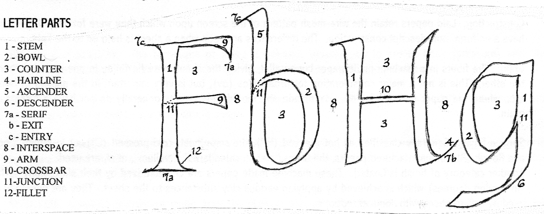
DESCENDER
See “Letter Parts.”
ENGROSSING
In contemporary usage, the addition of information (names, etc.) to printed documents using a formal hand.
ENTASIS
See “Waisting.”
EXEMPLAR
A model sheet, manuscript, etc., held up as an example of a given hand worthy of being copied. Ideally, an exemplar is completely devoid of any idiosyncratic elements of its creator, a feature which is very rarely accomplished.
FLOURISH
Somewhat synonymous with Swash (qv). Typically, a flourish is more decorative than a swash.
FLUSH
A body of writing when the ends of all the lines are aligned vertically at either the left (flush left) or right (flush right) margin on the page. See also “justified.“
FOUNDATIONAL or FOUNDATION HAND
A teaching hand developed by Edward Johnston, ca. 1895, from a 10th century manuscript widely used as the basic hand for teaching beginning calligraphers.
FUGITIVE
A term used to describe an ink or pigment that is not lightfast; a non-archival medium.
Usually annotated on the container with a grade of C (AA being the most lightfast).
GOTHIC
A term used to describe letterforms or other decorative forms that contain the pointed arch that is characteristic of Gothic architecture. Used frequently as a synonym for Black Letter (qv).
GOTHICIZED ITALIC
A quasi-historic calligraphic hand that combines characteristics of Italic (qv) letters and the Gothic pointed arch. Very popular for use in formal documents.
GOUACHE
Pronounced “goowash.” Also called “designers colors.“ Opaque watercolor widely accepted as superior to inks for colored writing and decoration because of its purity, opacity and brilliance. It closely duplicates the materials used by ancient scribes and rubricators, without the inconvenience and toxicity.
GUIDELINES
The lines ruled on a sheet of paper to define the size and slant of letters and their constituent parts:
GUM ARABIC
The resin from a tree native to North Africa. When dissolved in water, it is useful as a binder for inks and pigments.
GUM SANDARAC
A resin that, when ground into a powder, is used to improve the writing surface of vellum, parchment and most papers.
HALF-UNCIAL
An historic hand that evolved around the 5th and 6th centuries on the European continent; the first use of ascenders and descenders in a formal hand.
HAND
The calligraphic term for a specific letter form. In non-calligraphic circles the terms, font, typestyle, type face, etc., are used.
HUMANIST
A term used for a wide range of book hands (qv) that evolved during the period between 825AD and about 1600AD, when literacy was moving out of the monasteries and into the secular world.
ILLUMINATION
The use of metals in the decoration of letterforms or other decorative elements in a manuscript. In contemporary usage, the term defines any treatment of a letter, a device or a page. See also “Rubrication.”
INK
Among calligraphers, inks are generally classified by two dichotomies: pigmented vs. dye-based, waterproof vs. non-waterproof.
Pigmented inks are composed of some sort of solid material (usually carbon), water and a binder such as Gum Arabic (qv). Dye-based inks get their coloring from various non-solid chemical dyes. Pigmented inks are preferred because of their opacity and permanence. Dye-based inks are generally more transparent, not lightfast and frequently have an acid content that renders them non-archival. Dye-based inks are designed primarily for fountain pens, since they don’t have solids that will clog the mechanisms. Most colored inks (i.e., not black) are dye-based.
Non-waterproof inks are superior for calligraphic use, with a few exceptions, because they contain no varnishes (the waterproofing agent). These substances will clog the pen and usually cause the ink to bleed into the writing surface, causing fuzzy edges. Additionally, a lot of varnishes are acidic.
Oriental stick inks and Japanese Sumi (a liquid version of stick ink) when of good quality (which is usually directly related to price) are generally considered to be the best available. “India“ refers to pigmented inks, usually but not always waterproof, that are variable in quality and whose ingredients are known only to the manufacturers. Their purity and performance varies greatly. The term “permanent“ simply means that the ink spots won’t come out of your clothes.
INTERLINEAR SPACE
Also called “Line Spacing;” the space between lines of writing. Infrequently called the X-space. Determined by the calligrapher based upon design considerations and the hand used.
INTERSPACE
Also called “interliteral space;” the space between letters in a word. Arguably the most important factor in the quality of a written text.
ITALIC
A calligraphic hand developed in the 16th century by Vatican Chancery scribes, arguably the most useful and popular calligraphic hand extant. Referred to also as Chancery or Corsivo (cursive).
JUSTIFIED
Describes the body of text in which both the left and right edges of the writing are flush (qv) with the margins. In medieval manuscripts this was often accomplished by the addition of decorative devices to fill out lines of text that stopped short of the right margin.
LAYOUT & DESIGN
A term used to define the process through which a calligraphic work is developed. It involves the synthesis of one or more calligraphic hands with considerations of legibility, beauty, balance, composition, texture, etc., to create a finished piece that is intended to visually magnify the words within the text, and to express the vision of the calligrapher.

LETTERING
Generally refers to the technique of drawing letters as opposed to writing them. Versals (qv) and other decorated letters are examples of lettering.
LIGATURE
(Noun), the name given to a character that is formed by the conjoining of two letters, or (verb) the act of creating such a character. A ligature may be used to conserve space, to preserve historic accuracy, or as a strictly decorative or design element.
MAJUSCULE
(ma-JUS-kyool) The calligraphic or paleographic term used for a capital letter. In typographic parlance, the term is “upper case,“ from their traditional location in the typesetter’s case. See “Minuscule.”
MANIPULATION
The technique of twisting the pen while making a stroke in order to vary the width and character of the stroke, or to form a serif (qv); especially characteristic of brush writing. See Twist-stroke at “Serif“.
MANUSCRIPT
In calligraphic terms, any document written by hand (manu=hand + script=to write). The term is generally used in reference to historical documents and books.
MINUSCULE
(min-US-kyool) The small or “lower case“ letters. See “Majuscule.”
MONOLINE
Writing or letters, calligraphic or otherwise, lacking the thick and thin strokes that characterize work done with a traditional broad-edged calligraphic tool.
NIB
A pen point. See “pen.”
PALEOGRAPHY
The study of old manuscripts (qv) as a means of learning about ancient civilizations and cultures; related to paleology.
PAPER
Any substrate (qv) composed of vegetable fibers; a field of study in itself. Calligraphers are generally concerned with:
Sizing: Substances such as gelatin or various glues added to the paper, either internally or externally, during manufacture to control absorbency. Paper towels and waxed paper are examples of the extremes.
Rag Content: Rag papers contain fibers of cotton or linen in varying percentages. Non-rag paper is made from wood pulp. Rag fibers are superior because they make a stronger and more archival paper.
Acid content: Measured by pH; a pH of 7.0 is considered neutral. Above 7.0 is alkaline and below 7.0 is acidic. 100% rag papers are acid-free, since the fibers contain no lignin (as in wood), and no acidic chemicals are required in the manufacturing process. Papers with some rag content (EG, 25% cotton stationery) usually are not archival (qv), since some wood pulp was used. Paper must be both acid- and lignin-free in order to be considered archival.
Method of forming the sheet: Paper may be hand-, mould-, or machine-made, and each has its advantages and disadvantages.
Construction: Laid papers retain the wire-mesh pattern of the screen upon which they were formed; wove papers have a uniform, non-descript construction. The differences are seen when a sheet is held up to the light.
Grain: The fibers in a machine-made paper lay parallel, giving the sheet more flexibility in one direction than in the other. This is not a major consideration for broadsides (qv), but is very important in the making of books, etc. where the paper is to be folded. Handmade and mould made papers generally do not have discernible grain.
Surface finish:
Generally classified as hot-pressed (HP), the smoothest; cold-pressed (CP) (or in Britain, “not“); and Rough (R). In manufactured papers, the terms “plate,” “calendared,” “vellum,” etc., are used.
Another category of finish is Coated. These machine-made papers are characterized by their slick, shiny surface (in varying degrees) which is achieved by applying various clay substances to the sheet. They are generally not used by calligraphers, with some exceptions.
PAPYRUS
An ancient writing substrate made from the fibers of the papyrus plant, native to the Nile delta in Egypt. Papyrus was displaced by parchment (qv) as a favored substrate throughout the Mediterranean and European areas over a period of centuries from about 300BC to 300AD. It is still available.
PARCHMENT
The general term for an animal skin prepared for use as a writing sheet; usually goat or sheep, but deer and other skins may be used. Vellum (qv) is a parchment made from calf skin, and is generally held to be superior to other skins. See also “Vegetable Parchment.”
PEN
Any writing or drawing instrument intended to be used with a liquid medium. Also pen points, dip pens or Nibs. Aside from the use of commercial markers and mechanical pens of many sorts, calligraphers generally prefer dip pens for serious work, where the sharpness and delicacy of pen strokes are crucial. Nibs are made by a number of different companies, some of the more well-known being:
Mitchell: Their Rexel and Roundhand broad edge nibs are valued by calligraphers for their flexibility and sensitivity. Frequently, beginning calligraphers will find that they haven’t yet developed a fine enough “touch“ to be able to use these effectively.
Brause: A very hard, stiff broad-edge nib, very similar to the “feel“ of a ball point pen or pencil, and thus sympathetic to the heavy hand of a novice. Brause also makes the EF66, a pointed nib very popular for copperplate (qv).
Tape: A broad-edge nib similar in appearance to the Brause, but more flexible. A very good nib for the beginner, since it requires some degree of lightening of the touch, but is far more forgiving of a heavy hand than is the Mitchell.
Hunt: Their most well-known nib is the Speedball, which a lot of people start with because of its ubiquitousness in art and hobby stores. Its stiffness roughly equates to the Tape nibs. Hunt also makes a wide variety of pointed nibs suitable for copperplate writing (qv). Among these are the #101 Imperial, a perennial favorite.
Other companies such as Hiro, Esterbrook and Gillott make many dozens of nibs, some very good from a calligrapher’s viewpoint, some worthless. One can only experiment with several and discover which ones work and which don’t.
PENS, ALTERNATIVE
In addition to conventional pens, a very wide variety of instruments is used by innovative calligraphers and lettering artists to produce expressive letter forms. Among these are ruling pens meant for drafting, folded ruling pens made from various materials, Popsicle sticks, foam brushes, wads of paper toweling, mops (for very large writing), feathers (both ends) and pieces of balsa wood.
PEN ANGLE
The more-or-less constant angle at which a broad-edged pen is held when making letters, measured in degrees from the horizontal writing line (zero degrees). A 45-degree pen angle results in horizontal and vertical strokes which are equal in thickness (weight). Each traditional calligraphic hand has, as one of its basic characteristics, a prescribed pen angle.
PEN-WRITTEN CAPS
Roman majuscules written calligraphically. Capital letters based upon the classic Roman Capitals (qv), modified to be compatible with a specific calligraphic hand such as Foundational (qv) or Italic (qv).
pH
See “Paper.”
PRESSURE and RELEASE
The technique of creating thick (pressure) and thin (release) pen strokes. This is the technique that characterizes Copperplate (qv) writing as well as other Hands.
QUADRATA
Square capitals. A form of Roman capitals used in written documents of the 1st through 4th centuries, characterized by a squat, strong shape.
QUILL PEN
A writing instrument made from a feather. After curing, the tip is formed as a pen using a special knife and a considerable amount of skill. The result is a very delicate, sensitive instrument that is unsurpassed in producing beautiful calligraphy.
REED PEN
A writing instrument made from the stalk of a reed or bamboo plant; historically, the first writing instrument using ink on a substrate, rather than impressions into a clay tablet. A useful tool for writing on rough surfaces where a steel pen would tend to snag in the fibers and irregularities.
ROTUNDA
A bookhand of the Mediterranean area, circa 10th-13th century; roughly contemporary with Black Letter (qv) and sometimes interpreted by calligraphers as a “rounder, gentler black letter.”
RUBRICATION
The term rubrication comes from the Latin, rubric, “to color red.” The technique of adding color to a letter or a page. Usually, the term Illumination (qv) is used to describe the use of both metal and color.
RUSTIC or RUSTICA
Also Capitalis Rustica. A Roman majuscule alphabet characterized by letterforms of about 7-8 nib x-height, written with a pen angle of 60-70 degrees.
SERIF
Any finishing stroke of a letter part, usually accomplished by either pen manipulation, an additional stroke or drawing with a corner of the pen.
SUBSTRATE
Any surface upon which writing, painting, etc., is done; includes paper, vellum, parchment, etc.
SWASH
Also “Flourish.” A decorative stroke added to a letter or to a body of writing. Should only be used when (1) the calligrapher is competent in its accomplishment, and (2) its location and function are a necessary part of the overall design and balance of the work. “A well-made letter needs no decoration, and no amount of decoration can conceal an ill-made one.“ – Anon.
UNCIAL
An all-capital hand developed in Europe immediately following the era of Roman influence. Characterized by letter bodies that are slightly wider than tall. See also “Half-Uncial.”
VEGETABLE PARCHMENT
A kind of paper manufactured with the intent to make it look like Parchment (qv). Known outside of calligraphic circles as “calligraphy paper.“ Most of the different offerings are characterized by a high acid content and an extremely variable, erratic surface; not conducive to good work or a long-lasting result. Crane’s Artificial Parchment and Pergamenata are two exceptions to this description.
VELLUM
See “Parchment.”
VERSALS
Drawn or built-up letters (qv) of decorative character used as initial letters in a text (marking “verses“ – hence their name). Usually but not always decorated or illuminated (qv). Lombardic capitals are one of the most salient examples, but versals based on Roman capital forms and others are widely used.
WAISTING
Describes the narrowing of the center of the stem of a letter, or the corresponding “flair“ of the extremities. The Greek word often used is Entasis. Waisting may be achieved via pen manipulation, pressure and release, or building-up (see Built-up Letters).
WAIST LINE
The guideline used to define the top of the bodies of minuscule letters (see Guidelines).
X-HEIGHT
The height of a letter, from the base line to the waist line, measured in nib-widths. A basic measure of proportion used to define a specific calligraphic hand. EG: Italic letters are usually written at an x-height of 4.5 or 5 nib-widths, so when written with a 1mm nib, the letters would be 4.5 to 5 mm tall; With a 3 mm nib, the letters would be 13.5 to 15 mm tall. See “Guidelines.”